
Did you know that for a brief time in 2017, Google Earth revealed the existence of a great underwater wall spanning half the planet?

Of course, the wall doesn't actually exist. Running along the 180th meridian (i.e., where east meets west on a map), this "wall" is clearly the result of an error in stitching together the countless images comprising the totality of Google Earth. But to an excitable mind, this minor anomaly is enough to weave into a tapestry containing Biblical prophecy, Howard Hughes, gigantic sea monsters and much more.
Even if the gigantic undersea wall isn't real, what about these mysterious spires rising from the seafloor? Could they explain the mysterious loss of a Soviet submarine?

...or is the more likely explanation simply an error in the underlying sonar data used to construct the seafloor map?
Sharp changes in data are usually artificial, either due to issues in the data collection process or administrative factors such as changes to definitions. This hasn't stopped us from over-interpreting these apparent changes, particularly during the COVID-19 pandemic.
Since the beginning of the pandemic, "case dumps"—large numbers of backlogged cases being added all at once—have caused alarm, seeming to represent large spikes in transmission but in reality just highlighting cracks in the data collection system. This has happened with deaths as well: a simple catch-up in the data masquerades as a tsunami of virus deaths.
Sharp changes in data—discontinuties—can also arise for other reasons. For example, the definition of the quantity being measured may have changed; alternatively, how it is measured may have changed. For example, changing case definitions for a disease make it difficult to compare changes in incidence over time. In Canada, PCR testing for COVID-19 became severely restricted at the beginning of 2022, making it difficult to guage the true changes in the prevalence of SARS-CoV-2 infection before and after, since we know a much smaller fraction of cases are now being officially recorded.
These sharp discontinuities are not just a hinderance, however. For many researchers, they represent an opportunity. A whole category of research studies exists to exploit these artificial differences: regression discontinuity design.
The idea behind this research technique is to compare outcomes between groups on opposite sides of arbitrary cut-offs. A good example of this study design is Hoekstra (2009), which asked to what degree attending the most selective state university had a positive effect on future earnings. A simple comparison between the earnings of those who attended the most selective state school compared to those who attended a less selective state school is problematic: those more likely to be admitted to the most selective state school likely have other positive qualities that would positively impact their future earnings regardless of which school they ultimately chose to attend.
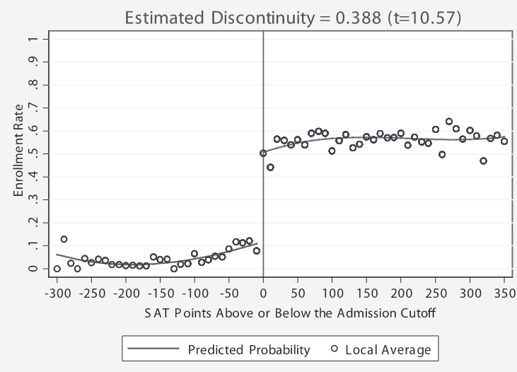
So what Hoekstra did was exploit an arbitrary discontinuity in the data: students that just met the SAT cutoff of the most selective school were much more likely to be enrolled in the most selective school, compared to students that the were just below the cutoff (obviously, the cutoff was not strict, as some students not meeting the cutoff were still enrolled). The students just failing to meet the cutoff were likely to enroll in one of the state's less selective schools instead.
Still, a student with an SAT score just above this arbitrary cutoff is probably not that different from a student with an SAT score just below the cutoff. What is different is their probability of enrolling at the most selective school. Obviously, they are much more likely to be enrolled if they meet the SAT cutoff. This is represented on the plot below as a huge discontinuity just above the SAT score cutoff.
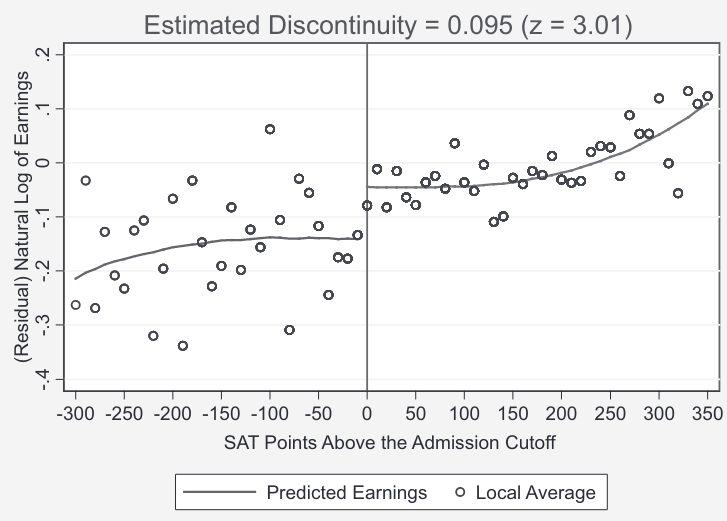
In terms of estimating the effect of attending the most selective school, you may look at the plot of predicted earnings on either side of the SAT cutoff. As previously mentioned, this relies on the assumption that students on either side of this arbitrary cutoff are basically the same except for one thing: their probability of attending the more selective school. And indeed, you see a jump on the right side of this cutoff, corresponding to a jump in future earnings of about 20%.
Another classic example is health care: in America (as well as many parts of Canada), people gain access to various health insurance programs at age 65. Yet, this is not much difference in overall health between someone who is 64 and someone who is 65. Thus, it is instructive to compare various health outcomes for those that are just below the age cutoff for these programs and those who just above.
For those interested in learning more about the subject of regression discontinuity design, follow this link to the relevant chapter in Scott Cunningham's wonderful Causal Inference: The Mixtape, from which the above examples are taken.